top of page

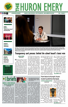
Here is the front page that I designed for our third issue in the 2023-2024 school year. The biggest challenge that I faced when designing this page was making sure the graphic was placed perfectly. I had to make five different examples, all different designs to make sure that it fit our style, as well as looked the cleanest. In the end, although my staff and I decided that we liked the first design the most, I learned about the rules of design and how to base a graphic around a piece.

Here is the first front page that I designed for the 2023-2024 school year. Although I have designed front page before, this is when I feel in love with designing front page. I loved the way that photos can draw people in. I worked very hard on the dominate piece, writing about how our schools superintendent was jousted. I covered the school board for a month on end, Wednesday night always being busy at board meetings. This made me become invested in design. I wanted to tell the story in not just writing, but as well as design. I am proud of the way I heard multiple school members talking about the front page, and showing how professional stories can be told in high school newspapers.

For issue One of the 2023-2024 school year, I was in-charge of designing the spread. Although I was very stressed, and still have a long way to learn about spreads, this was the first time I became confident in my designing abilities. Before, I did not know much. I always worked with others, and asked for graphics, this time I had to lead myself. It was a change at seeing how two pages looked together, and how to design for readability. I have never learned more than when I designed this spread.

Here is another example of a front page I designed the 2023-2024 school year. This is the proudest I ever have been of a design. In my publications past, we have never had a dominate photo with just a headline magazine style. After our staff went through our photographers photos, I knew I wanted a sports magazine styled front page. I was nervous putting it together, and working with our design grid, but now I am very happy with how it turned out. I love the way I was able to take a risk, and learn along the way.

This was a design I did for an entertainment page in our second issue. I based this design off of a design I saw one of my previous editors create the year before. When designing this page, I learned a lot about how to create cutouts. I learned the ways to use text-wrap, and the individual tools in InDesign like the anchor. In addition, I learned how to work through struggling to create a graphic. I knew I wanted to recreate the two albums, so I learned to work with my staff. After designing this page, I have gained confidence when reaching out for help. This is important because I am always learning, and I was able to learn how to navigate InDesign faster as well as learn about creating graphics.

Over my past three years of designing, the biggest surprise to me was how important photos are to the story. This is especially seen in photostories. This was a photostory I designed for 2023-2024's fourth issue. When choosing photos, I wanted to tell the story, and show the people inside them. I have learned that photos are just as important as words, them being the first thing people see when looking at a page. Ot
bottom of page